Table of contents
The psychological allure of symmetry in visual design
Symmetry holds an undeniable appeal in visual design, rooted deeply in human perception. The brain instinctively recognises and processes balanced structures more efficiently, making symmetrical designs more aesthetically pleasing and easier to comprehend. This principle is extensively applied in web design, where well-structured layouts foster clarity and engagement. When elements are evenly distributed, users navigate pages with greater ease, reducing cognitive effort and enhancing the overall experience.
The psychological preference for symmetry is evident in various disciplines, from architecture to branding, where it conveys order, stability, and trustworthiness. Websites leveraging symmetrical structures create a sense of familiarity, making users feel comfortable and in control. Whether through grids, mirrored components, or proportional spacing, balanced layouts establish an intuitive flow, subtly guiding visitors towards key information and actions without causing visual strain.
Why the human brain prefers balance
The preference for balance is not merely aesthetic but is deeply embedded in cognitive processing. The brain constantly seeks patterns and structure to make sense of its surroundings, an evolutionary trait that enhances survival by quickly identifying harmony and anomalies. This instinct translates into digital experiences, where users are drawn to web pages that exhibit equilibrium, allowing for effortless interpretation of content.
Neuroscientific studies indicate that symmetrical patterns activate the brain’s reward centres, eliciting positive emotional responses. This effect is particularly relevant in web design, where first impressions are formed in milliseconds. A well-balanced interface reduces uncertainty, fostering a perception of reliability. In contrast, disorderly layouts demand more mental effort, often resulting in frustration and increased bounce rates.
How the brain processes symmetrical structures
Visual processing in the brain is optimised to detect symmetry with remarkable efficiency. The occipital lobe, responsible for interpreting visual stimuli, responds more rapidly to symmetrical patterns compared to irregular arrangements. This is because symmetry reduces informational complexity, allowing the brain to process images holistically rather than piecing together fragmented details. Web designs that incorporate structured alignment capitalise on this cognitive shortcut, making interfaces feel immediately accessible and comprehensible.
Psychological research highlights that symmetry not only speeds up perception but also enhances recall. Users are more likely to remember and interact with websites that present organised, predictable layouts. This is particularly significant in user experience (UX) design, where first-time visitors must quickly grasp navigation patterns. A site structured with symmetrical components supports effortless information retrieval, streamlining interactions and fostering a seamless digital journey.
The evolutionary advantage of symmetry in human cognition
Symmetry preference is deeply rooted in evolutionary psychology, shaping how humans assess their environment. In nature, symmetrical patterns often indicate health, safety, and structural integrity, whether in animal features, plant formations, or environmental landscapes. This inherent bias extends to modern visual culture, where balanced imagery signals stability and professionalism. In web design, symmetry subconsciously reassures users, reinforcing trust and credibility in a brand’s digital presence.
Evolutionary scientists propose that symmetrical perception is linked to survival instincts, aiding in threat detection and environmental assessment. This is why humans tend to feel at ease in structured, harmonious spaces. In digital contexts, a website that maintains proportional balance aligns with these deep-seated cognitive inclinations, reducing user hesitation and fostering prolonged engagement. Strategic application of symmetry ensures that web interfaces resonate with visitors on an intuitive level, enhancing both usability and conversion rates.
Defining symmetry and asymmetry in digital layouts
Symmetry refers to the balanced arrangement of elements within a layout, where each side mirrors the other either horizontally, vertically, or around a central point. Asymmetry, in contrast, intentionally disrupts this balance to create visual interest, often through uneven spacing, contrasting sizes, or dynamic positioning. Both approaches serve distinct purposes, yet symmetry remains a cornerstone for establishing clarity and order.
Digital layouts benefit from clearly defined structures where symmetry guides the organisation of content. Asymmetrical designs can introduce focal points and energy into a page, but symmetrical arrangements tend to promote a sense of reliability and predictability. Designers must evaluate the desired tone and user experience to determine which method aligns best with their overall strategy.
The role of symmetry in usability and aesthetic appeal
Symmetrical layouts contribute significantly to usability by offering a straightforward visual hierarchy. Evenly distributed elements allow users to scan information effortlessly, reducing cognitive load and enhancing readability. A balanced composition can direct attention naturally towards key messages and calls to action without overwhelming the visitor with conflicting visuals.
The aesthetic appeal of symmetry lies in its inherent order and harmony. A clean, balanced interface fosters a positive first impression, conveying professionalism and trustworthiness. Such design choices improve the overall user experience, as clear and consistent layouts facilitate smoother interactions and support user engagement across devices and platforms.
The impact of symmetrical design on user behaviour
Research using eye-tracking technology has revealed that symmetrical designs capture user attention more effectively. Consistent visual patterns direct the eyes towards central focal points and guide the natural flow of content consumption. This predictable visual pathway ensures that essential elements receive the necessary exposure, enhancing the overall efficiency of the user experience.
Studies demonstrate that balanced designs reduce the need for excessive scanning, as users can intuitively grasp the structure of a webpage. When visual cues are harmoniously arranged, visitors are more likely to remain engaged and follow the intended navigation path. This data underscores the importance of symmetry in creating interfaces that not only attract attention but also sustain it throughout the user journey.
How symmetry affects navigation and engagement
A well-structured, symmetrical design simplifies navigation by clearly delineating sections and hierarchies. Users can quickly locate information and transition between different parts of a website with minimal effort. This intuitive layout minimises confusion and supports a seamless browsing experience, ultimately contributing to higher satisfaction and lower bounce rates.
Engagement tends to increase when users encounter familiar, orderly patterns that reduce decision fatigue. Clear, balanced layouts provide a comforting framework that encourages exploration and interaction with the content. Strategic use of symmetry not only enhances aesthetic value but also facilitates a smoother, more engaging user experience that can lead to improved conversion rates.
Types of symmetry in web design
Reflectional symmetry (mirroring elements)
Reflectional symmetry, also known as bilateral symmetry, occurs when elements on one side of a design mirror those on the other. This is one of the most common forms of balance in web design, providing a sense of structure and predictability. It is often used in navigation bars, split-screen layouts, and forms where uniformity enhances user comprehension.
This type of symmetry is particularly effective in maintaining a professional and polished aesthetic. It ensures that content remains visually balanced, reducing distractions and cognitive strain. However, excessive mirroring can lead to a monotonous appearance, which is why designers often incorporate subtle variations to keep the layout engaging.
Rotational symmetry (repetitive patterns)
Rotational symmetry is achieved when elements rotate around a central axis while maintaining a consistent pattern. This technique is commonly used in circular design structures, such as logos, loading animations, and infographics, where visual coherence reinforces brand identity and user engagement.
Web designers leverage rotational symmetry to create a sense of rhythm and flow within a layout. The repetition of patterns or shapes encourages users to follow a structured path, subtly guiding their attention towards key areas of interest. This technique can be particularly useful in e-commerce or data-driven platforms, where structured presentation enhances readability.
Translational symmetry (grid-based alignment)
Translational symmetry occurs when design elements repeat across a layout without rotation or reflection, creating a grid-like structure. This method is widely used in modern web design, particularly in content-heavy websites where clarity and order are paramount.
Grids provide a stable foundation that ensures consistent spacing and alignment across different sections. Translational symmetry enhances readability by establishing predictable layouts that users can scan effortlessly. This structured approach is commonly seen in portfolio sites, news platforms, and e-commerce stores, where uniformity aids navigation.
Radial symmetry (central focal points)
Radial symmetry centres design elements around a single focal point, creating a sense of unity and balance. This technique is often seen in hero sections, logos, and interactive features where a central component draws the user’s eye.
Using radial symmetry effectively ensures that attention is directed towards the most critical elements of a page, such as a call-to-action or a key product feature. When executed correctly, it enhances engagement by establishing a strong visual hierarchy that naturally guides user interactions.
Symmetry vs. asymmetry: When to break the rules
While symmetry provides stability and order, asymmetry introduces dynamism and contrast. In strategic design, breaking symmetry can be an effective way to draw attention to specific elements, such as a promotional banner, a sign-up form, or a featured product. Asymmetry disrupts predictability, encouraging users to focus on areas of interest that might otherwise blend into a uniform layout.
Intentional asymmetry can create a sense of movement and energy, making a design feel more modern and engaging. It allows designers to establish focal points by manipulating size, spacing, and colour contrasts. The key to successful asymmetry lies in maintaining a sense of balance, ensuring that the layout remains visually cohesive despite the irregularities.
Examples of brands effectively using asymmetrical balance
Leading brands often incorporate asymmetry to inject personality and uniqueness into their web design. Apple, for instance, frequently employs asymmetrical layouts to showcase product images alongside minimalistic text, creating a striking contrast that emphasises key selling points. Similarly, Airbnb leverages asymmetrical grids to highlight diverse accommodation options, enhancing visual storytelling while maintaining usability.
Asymmetry is also prevalent in fashion and luxury brand websites, where it is used to create bold, high-impact designs that stand out from conventional layouts. The success of these designs lies in their ability to maintain a structured flow despite their visual imbalance. When applied thoughtfully, asymmetry enhances engagement by making interactions more dynamic and visually stimulating.
Practical applications of symmetry in UI/UX design
Typography plays a crucial role in web design, and its alignment within a symmetrical structure significantly impacts readability and user perception. Centred text, evenly spaced columns, and balanced line heights contribute to a cohesive visual experience. Properly structured typography enhances clarity, ensuring that key information is easily digestible and visually appealing.
Spacing also plays a vital role in maintaining symmetry. Equal margins, consistent padding, and proportional white space create a sense of order that makes navigation more intuitive. Whether designing a landing page or a product listing, content structure must follow a logical sequence that leverages symmetrical patterns to optimise user engagement and ensure smooth information flow.
The influence of symmetrical elements on mobile responsiveness
With the growing importance of mobile-first design, symmetry must be adapted for smaller screens without compromising usability. Responsive web design relies on flexible grids that maintain proportional balance across different devices. A symmetrical layout simplifies this process, as elements can be rearranged while preserving harmony.
Mobile navigation benefits greatly from symmetrical design, ensuring that buttons, images, and text blocks align cohesively regardless of screen size. Well-structured responsive designs reduce clutter, prevent excessive scrolling, and maintain consistency across devices.
How symmetrical layouts improve clarity and reduce cognitive load
A well-balanced layout simplifies decision-making by reducing visual distractions. Users process information faster when content is structured logically, allowing them to focus on key elements without unnecessary cognitive strain. Symmetry provides a clear and predictable interface, preventing confusion and enhancing the likelihood of conversions.
Reducing cognitive load is particularly critical in e-commerce and landing pages, where users are expected to make quick purchasing decisions. A symmetrical design ensures that important elements such as product descriptions, pricing details, and calls to action remain prominently positioned, guiding users smoothly through the buying process without overwhelming them.
Case studies: Symmetrical vs. asymmetrical web pages and their performance
A/B testing has shown that symmetrical layouts often lead to higher engagement and conversion rates. In studies comparing symmetrical and asymmetrical web pages, those with balanced designs consistently perform better in terms of readability, time on site, and call-to-action interactions. The predictable structure of symmetrical designs builds trust, encouraging users to complete transactions or sign up for services.
However, strategic asymmetry can also enhance performance in specific contexts. For example, companies like Spotify and Nike utilise asymmetry to highlight promotions and key features, creating visual contrast that captures attention. The most successful designs strike a balance between symmetry and strategic asymmetry, leveraging both to maximise user engagement and drive conversions.
The neuroscience of symmetry in branding and trust-building
Symmetry plays a crucial role in how users perceive credibility. A balanced and well-structured website signals professionalism, reliability, and attention to detail. Users subconsciously associate order with competence, making symmetrical design an effective tool for building trust. When elements are evenly distributed, visitors feel more at ease, reducing scepticism and encouraging interaction.
Research in neuromarketing suggests that symmetrical designs activate brain regions linked to reward and pleasure, reinforcing positive brand perception. Websites with consistent layouts and aligned typography appear more polished, leading to longer user engagement and lower bounce rates. Creating a visually harmonious interface helps businesses establish authority and instil confidence in their audience.
The psychological connection between symmetry and perceived quality
Humans naturally associate symmetry with quality and refinement. This bias extends to digital experiences, where well-balanced websites are often perceived as more valuable and professional. A cluttered or uneven interface, on the other hand, can create doubt about a brand’s credibility, leading users to abandon a site prematurely.
Luxury brands frequently employ symmetrical design to enhance their image. High-end fashion and automotive websites, for example, use meticulously aligned elements to convey exclusivity and elegance. Structured layouts and proportional spacing reinforce the perception of precision, influencing customer behaviour and purchasing decisions.
Guidelines for balancing symmetry and creativity
Designing a symmetrical layout does not mean sacrificing creativity. Maintaining visual harmony while incorporating unique design elements ensures that a website remains engaging without feeling repetitive. Structuring content in grids or using proportional spacing allows for flexibility while preserving balance.
Combining symmetry with contrasting focal points can enhance usability. Using evenly spaced sections with a strategically placed call-to-action button ensures that users follow a logical path. Breaking symmetry in specific areas, such as hero sections or feature highlights, adds dynamic interest without disrupting the overall structure.
Common mistakes to avoid in symmetrical layouts
Over-reliance on symmetry can lead to monotonous and predictable designs. Websites that appear too rigid may lack engagement, failing to capture user attention. Introducing slight variations in typography, imagery, or background textures can prevent a design from feeling overly mechanical.
Neglecting mobile responsiveness is another common issue. A symmetrical layout that works on a desktop may not translate well to smaller screens. Ensuring that spacing, alignment, and proportions remain consistent across devices is critical for maintaining usability. Testing different screen resolutions and adapting symmetry dynamically prevents distortions that could impact the user experience.
FAQs
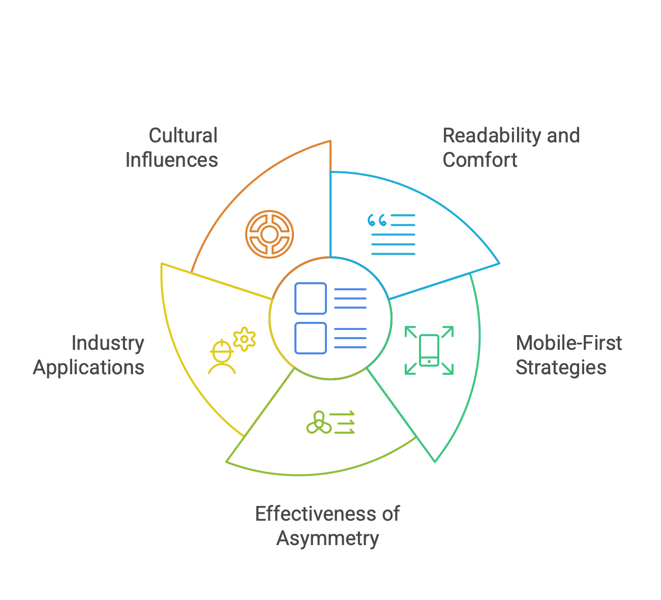
Does a perfectly symmetrical website always perform better?
A symmetrical layout enhances readability and user comfort, but absolute symmetry is not always necessary for success. Strategic asymmetry can create visual interest and guide attention to specific elements, improving engagement and conversion rates.
How does symmetry affect mobile-first design strategies?
Symmetry simplifies responsive design by ensuring that content scales proportionally across devices. A well-structured layout enhances usability on smaller screens, making navigation intuitive and reducing the need for excessive scrolling.
Can asymmetry be as effective as symmetry in UX design?
Asymmetry can be highly effective when used with intent. It draws attention to key elements and adds a dynamic feel to a design. The key is maintaining overall balance so that the layout remains visually cohesive and user-friendly.
What industries benefit the most from symmetrical web layouts?
Symmetry is particularly beneficial for corporate websites, financial services, healthcare, and luxury brands. These industries rely on trust and professionalism, which symmetrical designs naturally reinforce.
How do cultural differences influence the perception of symmetry in design?
Different cultures have varying associations with symmetry. Western audiences often associate symmetry with professionalism and order, while Eastern design traditions may embrace more fluid and asymmetrical compositions to reflect harmony in a different way. Understanding the target audience is crucial for selecting the right design approach.