insights
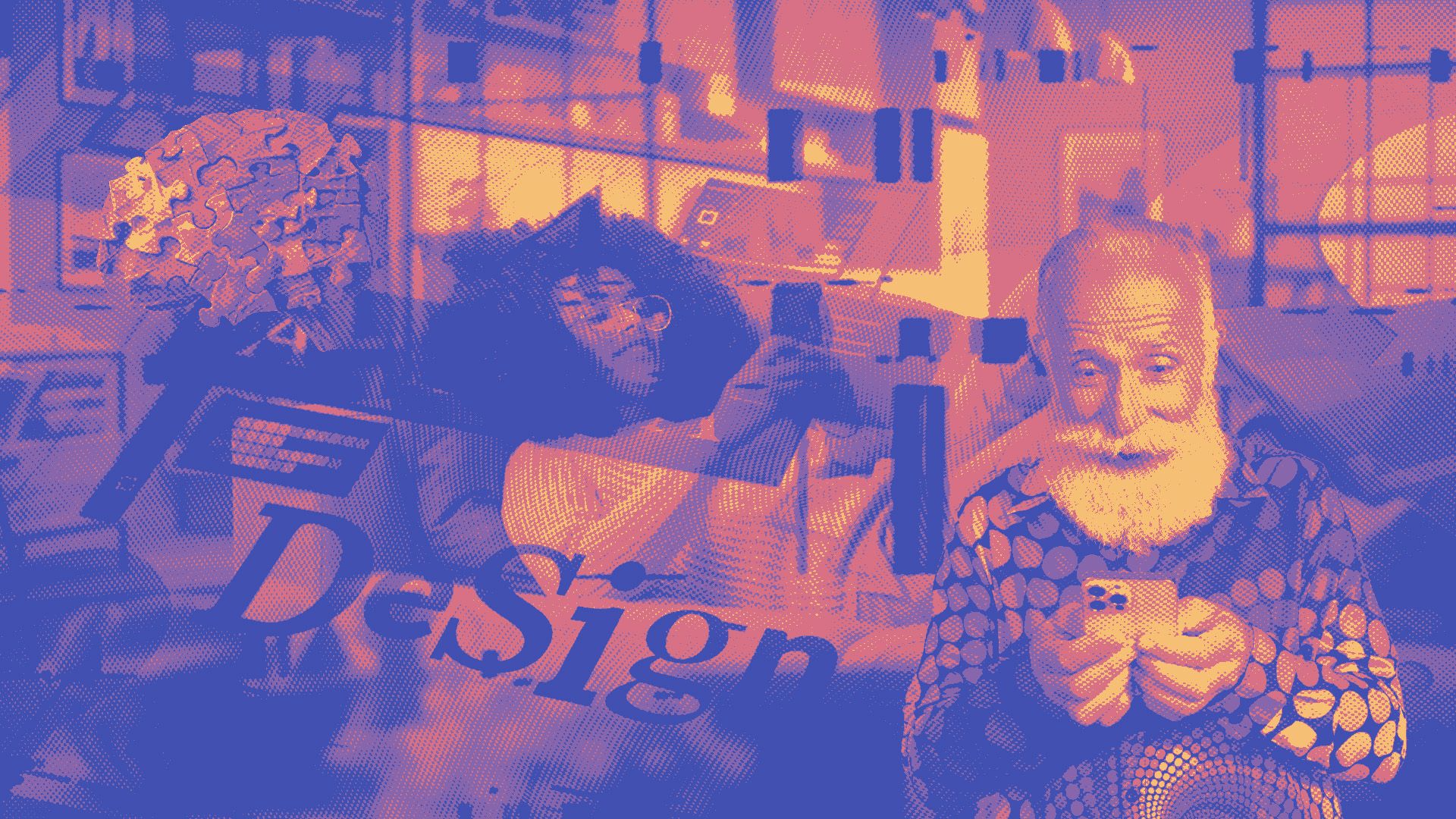
Turning E-Commerce Browsers into Buyers with Neurodesign
Successful e-commerce thrives on more than aesthetics; it requires understanding the human brain. This post uncovers how neurodesign leverages cognitive biases, colour psychology, and AI-driven personalisation to boost conversions and significantly reduce cart abandonment.
Cognitive biases that shape purchasing decisions Reducing friction and increasing trust How colour impacts perception and decision-making The F-pattern and Z-pattern in e-commerce layouts Urgency and scarcity How personalised UX influences buyer behaviour The role of split testing in e-commerce CRO Creating a neurodesign strategy that drives long-term growth FAQs The science behind conversion-driven design
User psychology forms the backbone of successful e-commerce design because purchasing decisions are fundamentally emotional, guided by subconscious cognitive biases. Every colour choice, button placement, and textual prompt can significantly impact consumer behaviour , either driving users towards a purchase or steering them away. According to neuromarketing research, understanding these psychological nuances can dramatically enhance conversion rates by aligning design decisions directly with inherent human inclinations towards trust, ease, and reward anticipation ( Neurons Inc, 2023 ).
Neurodesign harnesses insights from neuroscience to create digital experiences aligned with the natural workings of the human brain, thereby ensuring that e-commerce platforms don’t just attract visitors—they convert browsers into committed buyers. Employing principles such as visual hierarchy , emotional triggering through colour psychology , and carefully structured user journeys enables brands to influence consumer decisions subtly yet effectively, optimising every aspect of digital interactions to drive sales.
Cognitive biases that shape purchasing decisions
Numerous cognitive biases, including scarcity bias, anchoring, and social proof, dictate consumer choices, often without their conscious awareness. For instance, scarcity bias prompts users to act swiftly when confronted with limited availability, capitalising on the innate fear of missing out ( FOMO ). Neuromarketing studies illustrate how these biases, deeply rooted in evolutionary psychology, compel consumers to act promptly when faced with limited availability or time-sensitive offers, significantly increasing conversion rates ( Neurons Inc., 2025 ).
Another influential bias is the anchoring effect, where initial information presented to consumers frames their perception of value, influencing their willingness to purchase. Strategic design can capitalise on this bias by positioning premium products next to even more expensive options, subtly suggesting greater value and justifying higher price points. Mastering these biases allows e-commerce platforms to precisely engineer user experiences that resonate deeply, translating psychological insights into measurable sales performance.
The power of micro-interactions in guiding conversions
Micro-interactions —subtle animations or visual feedback triggered by user actions—significantly enhance user experience and conversion rates by providing immediate reinforcement of the user's actions, thus reducing uncertainty. Neuroscience research highlights that these interactions release dopamine, a neurotransmitter associated with pleasure and motivation, thereby encouraging continued engagement and nudging users towards conversion actions like adding products to the cart or finalising checkouts.
Moreover, effectively designed micro-interactions not only affirm user actions but also guide attention precisely where brands want it. Examples include the visual confirmation of adding items to a shopping basket or subtle movements in call-to-action (CTA) buttons when hovered over. Implemented correctly, these design nuances become powerful tools to guide user behaviour, seamlessly nudging shoppers from browsing to purchasing.
Reducing friction and increasing trust
Cart abandonment often stems from psychological friction such as uncertainty, mistrust, or perceived inconvenience. Consumers frequently encounter hesitations triggered by hidden costs, complicated checkout processes, or lack of trust signals. Studies indicate that around 70% of cart abandonment can be attributed to unexpected fees, complex checkout procedures, or security concerns ( Baymard Institute, 2024 ). Addressing these psychological friction points—such as unclear shipping costs, excessive checkout steps, or insufficient payment security reassurances—is critical to reducing abandonment rates.
Furthermore, cognitive overload plays a significant role in abandonment behaviour. Excessive choices, confusing interfaces, or unexpected complexity can trigger decision paralysis, causing users to defer or abandon purchases. Streamlining the purchasing process by minimising distractions, clarifying options, and simplifying the checkout experience leverages cognitive fluency, making it easier for users to finalise transactions.
Proven strategies to minimise drop-offs and recover lost sales
To tackle cart abandonment effectively, it’s crucial to employ targeted psychological strategies that rebuild trust and simplify the decision-making process. Transparent pricing, prominently displayed security certifications, and social proof (such as user reviews and ratings) help to reassure users, reducing hesitation. A proven method is the strategic use of microcopy around sensitive areas such as checkout forms, clearly addressing common customer concerns and setting accurate expectations for subsequent steps.
Additionally, retargeting and recovery emails leveraging urgency and exclusivity have shown robust results. Studies indicate that personalised cart abandonment emails with time-sensitive offers, reminders, or discounts tailored through AI-driven personalisation, can recover up to 15% of abandoned transactions ( Launch Online, 2025 ). By proactively addressing consumer doubts and hesitations through psychologically informed UX adjustments, brands effectively reduce friction and significantly improve conversion outcomes.
How colour impacts perception and decision-making
Colour profoundly impacts emotional responses and purchasing behaviours, acting as a powerful visual stimulus in e-commerce environments. Scientific research has shown that certain colours evoke specific emotional responses and influence consumers’ decision-making processes. For instance, red creates urgency and excitement, increasing impulsive purchases, while blue is linked to trust and reliability, commonly used by financial institutions and tech companies ( Cunningham, 2017 ). Employing the correct colours strategically within digital design can thus significantly boost conversions by aligning visual cues with desired consumer responses.
Moreover, cultural context heavily influences colour perception, necessitating thoughtful adaptation when expanding internationally. Studies confirm regional differences—for example, green symbolises prosperity and health in Europe, whereas in parts of Asia, it holds significant religious meanings that might affect its appropriateness as a CTA colour. Recognising and adapting to these cultural nuances through targeted testing ensures that colour choices drive desired actions effectively.
The F-pattern and Z-pattern in e-commerce layouts
Understanding visual patterns, particularly the F-pattern and Z-pattern, helps optimise webpage design for higher conversion rates. Research demonstrates that most users scan e-commerce websites following these distinct visual pathways. The F-pattern is typically observed on content-heavy pages, where users scan horizontally at the top, vertically down the left side, then horizontally again. Conversely, the Z-pattern is common in pages with minimal text and strong visual elements, guiding attention from the top-left to bottom-right, making it ideal for landing pages ( Nielsen Norman Group, 2024 ).
Effectively leveraging these patterns directs consumer attention to critical elements such as promotional banners, product images, and CTAs. By positioning high-value content strategically—such as featuring best-selling products or discount offers along these natural eye paths—brands significantly enhance user navigation and conversions. Aligning page layout design with these visual scanning behaviours creates intuitive user experiences, dramatically increasing engagement and conversion rates.
Contrast, spacing, and typography tricks to boost sales
Visual contrast and thoughtful spacing significantly affect usability and conversion rates by guiding users effortlessly towards key actions. Research by HubSpot reveals that clear contrast, particularly in CTA buttons and important messaging, can increase click-through rates by up to 21% ( HubSpot, 2024 ). Consistent spacing and typography hierarchy also reduce cognitive load, enhancing readability and facilitating smoother navigation, thus prompting higher engagement and better overall conversions.
Strategic typography use, such as bold headlines paired with subtler descriptive text, effectively structures information, ensuring users absorb key details quickly. Choosing readable, straightforward fonts and maintaining adequate white space ensures clarity and ease of navigation, reducing bounce rates and improving the overall user experience, crucially nudging consumers closer to purchase decisions.
Urgency and scarcity
FOMO is deeply embedded in human psychology, arising from our innate fear of loss, and can be powerfully harnessed in e-commerce strategies. Neuromarketing studies indicate that triggering urgency through limited-time offers activates the amygdala, stimulating quick decision-making and minimising procrastination (Neurons Inc., 2025). Real-time notifications such as countdown timers, low-stock alerts, or timed discounts significantly exploit these neural pathways, prompting immediate consumer responses.
Brands successfully tapping into urgency often deploy visual and textual cues strategically—like countdown timers or notifications highlighting limited availability—to heighten psychological tension. For instance, shoppable Instagram stories and TikTok videos integrating time-sensitive offers have led to direct purchases from approximately 30% of users exposed to them.
How personalised UX influences buyer behaviour
Personalised user experiences significantly increase conversions by aligning digital interactions with individual user needs, preferences, and past behaviours. A tailored shopping journey reduces cognitive friction by pre-filtering irrelevant options and highlighting products most likely to interest the user. Research from Mordor Intelligence indicates that AI-driven personalisation tools have boosted conversions by as much as 12% within sectors such as fashion and electronics ( Mordor Intelligence, 2025 ). This boost in conversion rates comes from the user's perceived relevance and reduced cognitive load, facilitating quicker decision-making.
Moreover, personalised UX leverages psychological principles such as the "endowment effect", where consumers value items or experiences higher when they feel specifically chosen for them. Advanced AI algorithms deliver such tailored experiences by dynamically adjusting product recommendations, promotional messages, and interfaces based on user behaviour, purchase history, and demographic profiling. Platforms like Amazon and ASOS have effectively harnessed AI-driven recommendation engines, significantly increasing both customer satisfaction and overall sales volume.
AI-driven recommendations and their impact on sales
AI-powered recommendation engines analyse historical user data and behaviour patterns to predict and present products precisely matching user preferences, increasing relevance and driving repeat purchases. Major e-commerce platforms, including Amazon and ASOS, capitalise on these predictive models, resulting in enhanced user engagement and significantly elevated sales performance. According to industry analysis, personalised recommendations have demonstrated a capacity to lift overall user retention by up to 40% due to more meaningful shopping interactions.
Integrating AI into the sales funnel goes beyond simple cross-selling; it also improves customer lifetime value by fostering deeper engagement through dynamically generated content and personalised marketing messages. The ongoing refinement of AI algorithms continually enhances their predictive accuracy, ensuring personalised strategies evolve with consumer preferences and market trends, thus maximising long-term profitability.
The role of split testing in e-commerce CRO
A/B testing is indispensable in e-commerce optimisation as it provides empirical evidence to validate design choices, removing subjective guesswork from the decision-making process. Split testing allows businesses to directly compare two or more variants of webpages to determine which yields higher conversions. Tools such as Optimizely facilitate this by providing real-time analytics, enabling marketers to pinpoint precisely which design elements resonate most effectively with their target audiences.
When integrated systematically, A/B testin g significantly reduces guesswork, enabling brands to adopt evidence-based strategies. Continuous optimisation, driven by iterative testing, ensures incremental and sustainable improvements, enabling businesses to adapt swiftly to shifting consumer behaviours, technology changes, and market dynamics. Companies engaging in ongoing A/B testing typically see up to a 20-30% boost in conversion rates annually, demonstrating the tangible value of continuous, data-driven design optimisation.
Tools and techniques for ongoing conversion enhancements
To sustain growth through continuous optimisation, companies increasingly rely on sophisticated analytics tools such as Google Analytics 4 and AI-driven platforms offering predictive modelling. Real-time dashboards allow businesses to measure conversion improvements instantly, providing actionable insights to optimise future interaction. Techniques such as multivariate testing, heat mapping, and session recordings further pinpoint consumer friction points, offering clear paths for design improvements.
Additionally, leveraging heatmaps and session recordings identifies behavioural trends, uncovering subtle barriers in the user journey that quantitative data alone might miss. Brands can then apply targeted design adjustments—like CTA repositioning or simplifying checkout forms—to reduce friction points effectively. The cumulative effect of these data-driven techniques enhances customer experience significantly, resulting in measurable improvements in overall conversion rates.
Creating a neurodesign strategy that drives long-term growth
Developing a robust neurodesign strategy involves systematically integrating cognitive and emotional insights to optimise consumer experiences. Key takeaways include prioritising psychological principles such as urgency, scarcity, cognitive biases, and personalisation to effectively guide consumer behaviour. From the colour psychology of your CTA buttons—leveraging red for urgency or green for reassurance—to employing visual hierarchies and personalisation powered by AI, each element strategically nudges users from casual browsing towards committed purchasing.
Additionally, addressing cart abandonment by reducing cognitive overload and building consumer trust through transparency and streamlined checkout experiences will significantly enhance conversion rates. Regular A/B testing, underpinned by actionable data insights, ensures continual refinement of these strategies. Successfully integrating these CRO secrets relies on understanding the nuanced ways users interact with your brand online, informed by cognitive and emotional factors that dictate consumer behaviour.
Next steps for boosting e-commerce performance
Moving forward, brands must proactively embed neuropsychology and advanced analytics into their ongoing design processes. Regular audits of site performance, alongside agile responsiveness to evolving user behaviours, ensure sustained competitive advantage. Leveraging advanced AI-driven personalisation tools, detailed analytics platforms, and psychological principles like FOMO and anchoring effects provides businesses with a formidable toolkit to maximise conversions continually.
To achieve sustained growth, e-commerce businesses should view their digital presence as a dynamic entity that requires constant fine-tuning. Aligning technology, psychology, and user-centric design, companies position themselves not merely as providers but as indispensable partners in consumers' digital interactions. As digital platforms evolve, maintaining a balance between scientific insight, data-backed design decisions, and consumer psychology is essential for long-term success.
FAQs
How does colour psychology influence online sales?
Colour psychology impacts consumer emotions and decisions. For instance, red evokes urgency, prompting quick actions, while blue builds trust, ideal for financial transactions.
What are the most common reasons for cart abandonment?
Common reasons include unexpected costs, lengthy checkout processes, lack of trust signals, complicated navigation, and insufficient payment options.
How can I test if my e-commerce design is conversion-friendly?
Utilise A/B testing tools like Optimizely or Google Analytics 4 to compare design elements, identifying layouts, colours, or messaging that maximise conversions.
What role does AI play in improving conversion rates?
AI personalises user experiences, recommending relevant products based on past interactions, thereby boosting customer engagement and conversion rates significantly.
How often should I update my e-commerce website design for better CRO?
Update continuously using A/B testing and data insights. Regular small adjustments based on user behaviour yield better results than infrequent major redesigns.