The psychology behind micro-persuasion in UX
Small design elements have a profound impact on user behaviour, often without conscious awareness. Digital platforms leverage micro-persuasion techniques to guide visitors toward specific actions, such as adding items to a cart or signing up for a newsletter. These tactics draw from behavioural economics and cognitive psychology, where small "nudges" influence choices without restricting options. For example, simply highlighting a “Best Seller” tag on a product increases its likelihood of being chosen due to the bandwagon effect.
Richard Thaler and Cass Sunstein’s concept of "nudge theory" demonstrates how minor tweaks in presentation can shape decisions while maintaining user autonomy. This principle is widely used in e-commerce, where a simple message like “People who bought this also bought…” can subtly push users toward making a purchase. Such techniques rely on the human tendency to follow implicit cues, reinforcing the idea that good UX design is as much about psychology as it is about aesthetics.
Cognitive biases that shape online purchasing behaviour
E-commerce platforms subtly exploit cognitive biases to drive engagement and conversions. The default effect, for instance, ensures that users are more likely to accept pre-selected options, such as subscribing to newsletters or opting for higher-tier products. Similarly, the loss aversion bias makes limited-time offers or exclusive deals appear more valuable, prompting immediate action to avoid missing out.
Another powerful bias is the endowment effect, where users place higher value on items they perceive as already theirs. Features like “Save for later” or virtual try-on tools in online shopping trigger this bias, increasing the likelihood of purchase. UX design that incorporates these psychological principles enhances user experience while aligning with business objectives, demonstrating that persuasion in digital interfaces is less about coercion and more about intelligent design.
Visual hierarchy: guiding users’ attention without them noticing
Every design choice influences user behaviour, with colour, contrast, and typography playing key roles in subconscious decision-making. Colour psychology suggests that warm tones like red and orange stimulate urgency, often used in "Limited Offer" banners, while blue and green evoke trust, making them popular for financial services and security badges. The strategic use of contrast, such as a brightly coloured CTA button against a neutral background, ensures that key actions stand out, reducing cognitive load and increasing click-through rates.
Typography also shapes user perception and interaction. Serif fonts, often associated with tradition and reliability, work well for luxury brands, whereas sans-serif fonts convey modernity and simplicity, enhancing readability in digital interfaces. Subtle tweaks, like adjusting font size and weight, can emphasise key messages, ensuring that important information is processed faster. When combined effectively, these elements create a seamless user journey where the most crucial actions feel natural and effortless.
How strategic element placement increases conversions
Users follow predictable eye-tracking patterns when navigating a webpage, and UX designers leverage these patterns to optimise layout and engagement. The F-pattern, where users scan content from left to right and then down, is common for text-heavy pages, while the Z-pattern, where attention moves diagonally across key elements, is ideal for landing pages with strong visuals. Placing high-impact content—such as product features or testimonials—along these natural reading paths ensures they receive maximum attention.
The strategic placement of CTAs is particularly influential in driving conversions. Eye-tracking studies reveal that users are more likely to engage with buttons positioned within their natural scanning flow rather than those buried in cluttered sections. E-commerce giants like Amazon place "Add to Cart" buttons at focal points within the user’s visual hierarchy, making the purchase process feel intuitive. Subtle spacing, whitespace, and alignment all contribute to guiding user attention smoothly toward desired actions, reinforcing how seemingly minor UX tweaks can yield significant business results.
The decoy effect and price anchoring in e-commerce
Pricing structures in e-commerce are rarely accidental; they are designed to influence perception and decision-making. The decoy effect, a principle in behavioural economics, occurs when an additional pricing option makes one of the original choices more attractive. For example, if a subscription service offers a basic plan for £5 and a premium plan for £15, many users may opt for the cheaper option. However, if a third “decoy” option is introduced—such as a £14 plan with fewer benefits than the £15 one—the premium plan suddenly seems like a much better deal, increasing its selection rate.
Similarly, price anchoring influences how customers perceive value. When an original price is crossed out next to a discounted price, users instinctively compare the two rather than assessing the real worth of the product. This effect is rooted in cognitive biases, where the first number a user sees sets a reference point, shaping their judgment. E-commerce giants like Amazon use price anchoring extensively, displaying "original" prices next to current deals to reinforce perceived savings. These tactics do not force a decision but subtly nudge users toward a desired outcome.
How limiting choices paradoxically boosts sales
Consumers often believe that more choices lead to better decisions, but psychology suggests otherwise. The paradox of choice, studied by Barry Schwartz, highlights that too many options can cause decision paralysis, reducing the likelihood of making a purchase. When presented with a vast array of nearly identical products, users may feel overwhelmed and abandon their carts altogether.
E-commerce platforms counteract this by simplifying selections. Many successful brands curate limited, high-quality options with clear distinctions between them. Apple, for instance, avoids overwhelming customers by offering only a few versions of each product, making the decision-making process effortless. Similarly, online retailers like ASOS use progressive disclosure, where users see a handful of top recommendations first, with the option to explore further if desired. These tactics streamline the purchasing journey, subtly guiding customers toward confident and swift decisions.
Microcopy: the hidden persuader in UX design
The wording of a call-to-action (CTA) can be the difference between engagement and abandonment. Studies show that action-oriented, benefit-driven CTAs significantly increase conversions. Instead of the generic “Submit” button, a phrase like “Get Your Free Guide” or “Start Your 30-Day Trial” provides immediate value, making the action feel rewarding rather than transactional.
Small linguistic tweaks can also instill urgency and exclusivity. Phrases like “Only 3 left in stock” or “Join 500,000 happy customers” tap into psychological triggers such as scarcity and social proof. The key to effective microcopy is precision—every word must serve a persuasive function. Airbnb, for example, uses a CTA like “Earn money as a host” instead of “Sign up to host,” subtly shifting focus to the financial benefit, which enhances conversion rates.
How reassuring microcopy reduces hesitation and increases trust
Users often hesitate before taking action, especially when it involves providing personal or payment details. Well-placed microcopy can address these concerns, reducing friction and reinforcing trust. A simple reassurance like “We’ll never share your email” near a sign-up form or “Cancel anytime” beneath a subscription button can significantly increase user confidence.
E-commerce checkout pages often include small trust signals to prevent cart abandonment. For instance, adding “100% Secure Payment” or displaying familiar payment icons (Visa, PayPal, Apple Pay) reassures users that their transaction is safe. Booking.com integrates reassuring microcopy by highlighting phrases such as “No payment required today” or “Free cancellation” to eliminate doubts before confirming reservations. These subtle yet impactful words shape the overall user experience, ensuring that every interaction feels secure, effortless, and rewarding.
Countdown timers, stock alerts, and psychological triggers
Scarcity and urgency are two of the most powerful psychological motivators in e-commerce, influencing users to act quickly before an opportunity disappears. Countdown timers, commonly used in flash sales and limited-time offers, create a sense of time pressure, triggering a fear of missing out (FOMO). This effect is rooted in temporal discounting, where people place higher value on immediate rewards, making them more likely to complete a purchase rather than postpone it. Amazon’s “Lightning Deals” leverage countdowns to encourage impulsive buying decisions by creating a race against time.
Similarly, low-stock alerts play on the scarcity principle. When a product page displays “Only 2 left in stock!” or “High demand! Selling fast,” users perceive the item as more desirable due to its limited availability. Psychological studies confirm that perceived scarcity increases perceived value, making shoppers less likely to hesitate. Booking platforms like Expedia and Airbnb frequently use messages like “Only 1 room left at this price!” to push users toward immediate booking, ensuring higher conversion rates without changing the actual product offering.
The ethics of urgency: persuasion vs manipulation
While scarcity and urgency tactics can boost conversions, they must be used responsibly. Overuse or deception—such as fake stock limitations or endlessly resetting countdown timers—can damage credibility and erode trust. Ethical persuasion relies on authentic urgency, ensuring that scarcity cues reflect actual product availability rather than fabricated pressure tactics.
Consumers are becoming more aware of manipulative strategies, and transparency is now a key component of effective UX design. Retailers that employ urgency honestly—such as highlighting genuine seasonal promotions or live inventory levels—foster long-term trust and repeat business. Brands like REI and Patagonia, for example, maintain ethical urgency by promoting limited-edition collections without artificial stock restrictions. Ethical micro-persuasion respects the user's autonomy, creating a balance between motivation and integrity.
The impact of page load speed and fluid navigation on buying behaviour

Even the most persuasive UX elements lose their effectiveness if a website is slow or difficult to navigate. Studies show that every second of delay in page load time reduces conversion rates by up to 7%, as users abandon sluggish websites in favour of faster competitors. Google’s Core Web Vitals emphasise the importance of speed, ranking sites higher when they deliver smooth, responsive experiences.
Fluid navigation is equally crucial. When users struggle to find key information—such as product details, checkout buttons, or return policies—they experience frustration, leading to higher bounce rates. E-commerce leaders like Apple and ASOS invest in intuitive design, ensuring that product categories, filters, and search functionalities are optimised for effortless browsing. The best UX reduces cognitive effort, allowing users to reach their desired action with minimal clicks and zero confusion.
Smart form design and checkout optimisation for impulse purchases
Checkout abandonment is a persistent challenge in e-commerce, with studies indicating that nearly 70% of online shoppers abandon their carts before completing a purchase. A common culprit is poor form design—lengthy, complex forms that demand unnecessary details create friction, discouraging users from finalising transactions. Smart form designstreamlines the process by using autofill, one-click purchasing, and clear progress indicators to reduce perceived effort.
Payment flexibility also plays a major role in reducing hesitation. Buy Now, Pay Later (BNPL) options, such as Klarna or Afterpay, allow users to complete purchases without immediate financial commitment, making high-ticket items feel more accessible. Additionally, trust-building elements—like “Money-back guarantee” statements and secure payment icons—reassure users at critical decision points. Amazon’s “One-Click Buy” feature exemplifies frictionless checkout, making impulse purchases effortless while maintaining a seamless user experience.
Social proof and credibility boosters in UX
Users instinctively seek validation before making a purchase, and social proof plays a crucial role in guiding their decisions. Reviews, testimonials, and trust badges act as psychological reassurance, reducing uncertainty and increasing confidence in the brand. Studies show that 92% of consumers trust user reviews as much as personal recommendations, making them one of the most influential factors in e-commerce conversions.
The way reviews are displayed can also impact their effectiveness. E-commerce giants like Amazon and Zalando highlight verified purchase labels, star ratings, and “most helpful” reviews at the top to streamline decision-making. Similarly, trust badges—such as security certificates (SSL, Norton Secured) or money-back guarantees—reinforce credibility, especially at checkout. These elements work silently in the background, shaping user perception and encouraging conversions without explicit persuasion.
Leveraging authority bias and community influence in branding
Authority bias suggests that people are more likely to trust and follow recommendations from perceived experts or authoritative sources. This principle is widely used in UX through expert endorsements, industry certifications, and influencer collaborations. For example, brands in the skincare and tech industries often highlight “Dermatologist-approved” or “Endorsed by professionals” labels to increase credibility.
Community influence further strengthens brand trust. User-generated content (UGC)—such as customer photos, video testimonials, or social media mentions—demonstrates real-world usage, making products more relatable. Platforms like Glossier and Gymshark actively integrate UGC into their websites, showing real customers using their products rather than relying solely on polished marketing images. These approaches make the brand feel more authentic, ultimately increasing engagement and customer loyalty.
A/B testing and data-driven persuasion
UX optimisation is not guesswork—it is driven by A/B testing, where two versions of a webpage or design element are tested to determine which performs better. Even minor changes, such as button colours, CTA wording, or image placement, can significantly impact user behaviour. For example, a simple switch from “Buy Now” to “Get Yours Today” may increase conversions by creating a sense of ownership.
E-commerce platforms continuously refine their interfaces based on these insights. Booking.com is known for relentless A/B testing, experimenting with elements like urgency messages, checkout form layouts, and pricing displays to optimise conversions. The key to effective A/B testing is data-driven decision-making—rather than relying on assumptions, UX designers analyse user behaviour and iterate on successful patterns.
Real-world case studies of micro-persuasion in action
Several leading brands have successfully implemented micro-persuasion tactics through rigorous UX testing. For instance, Airbnb improved its booking completion rate by simplifying its form fields and adding trust signals like “Verified Hosts.” Similarly, Netflix increased sign-ups by optimising its free trial messaging, reinforcing that users could cancel anytime without obligation.
Another powerful case is eBay, which saw higher engagement by adjusting bidding timers and introducing dynamic pricing nudges. These changes tapped into loss aversion and competitive behaviour, making users more likely to commit to a purchase. These real-world applications show that UX micro-persuasion is not about manipulation but about enhancing user experience while aligning with business goals.
Our approach to UX refinement for higher engagement and conversions
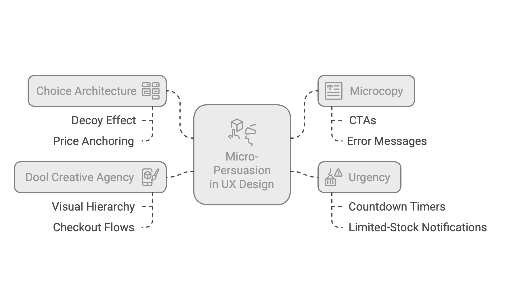
Micro-persuasion is an integral part of our UX design and e-commerce optimisation strategies. At Dool Creative Agency, we combine behavioural psychology with cutting-edge design techniques to subtly guide users toward desired actions. Our team refines visual hierarchy, choice architecture, and microcopy, ensuring that every design element serves a purpose. Whether it’s optimising checkout flows, crafting high-converting CTAs, or integrating trust signals, we design with conversion in mind.
Every business is unique, and we tailor our strategies based on user behaviour insights, ensuring seamless navigation, persuasive microcopy, and intuitive interaction flows. This process minimises friction, reduces cart abandonment, and enhances user satisfaction—turning passive visitors into loyal customers.
Why strategic UX design is the key to long-term e-commerce growth
E-commerce success is no longer just about having great products; it’s about creating a frictionless, persuasive digital experience. UX design plays a pivotal role in shaping how customers interact with a brand, and subtle micro-persuasion techniques build trust, increase engagement, and drive repeat purchases. Businesses that invest in strategic UX don’t just see short-term gains—they create sustainable, long-term growth.
At Dool Creative Agency, we believe that every small UX detail contributes to a larger behavioural shift. From optimising website speed and navigation to enhancing product page psychology, our team crafts experiences that not only convert but also foster brand loyalty. E-commerce success is built on user trust, and we ensure that every digital touchpoint strengthens that trust, leading to higher conversions and long-term profitability.
Subtle UX tweaks have a profound impact on user decision-making, shaping behaviour through strategic design rather than overt persuasion. From visual hierarchy and microcopy to choice architecture and social proof, these seemingly minor elements influence trust, engagement, and purchasing decisions in ways users don’t consciously perceive. Leading e-commerce brands continuously refine their interfaces, using A/B testing and behavioural insights to create a frictionless, conversion-focused experience.
At Dool Creative Agency, we specialise in implementing these powerful UX strategies to optimise e-commerce performance and increase conversions. Whether you need a complete UX overhaul, checkout optimisation, or persuasive design improvements, our expert team ensures that every micro-interaction works in your favour.
Elevate your e-commerce success with intelligent UX design that drives real results—get in touch today to transform your digital experience.
Frequently Asked Questions (FAQs)
What is micro-persuasion in UX design?
Micro-persuasion refers to subtle design elements that influence user behaviour without forcing decisions. This includes visual hierarchy, strategic microcopy, social proof, and urgency cues that gently guide users toward a specific action, such as making a purchase or signing up for a service. These tactics leverage psychological principles to create a seamless and persuasive digital experience.
How does choice architecture impact e-commerce conversions?
Choice architecture shapes how options are presented to users, influencing their decisions. Techniques like the decoy effect (offering a third pricing option to make another look more attractive) and price anchoring (displaying a higher original price next to a discount) help users perceive value more clearly. Well-structured choices reduce decision paralysis, increasing conversion rates.
Why is microcopy important in UX design?
Microcopy—short bits of text like CTAs, error messages, and reassurance notes—plays a crucial role in persuasion. Thoughtfully crafted microcopy reduces hesitation by providing clarity, reinforcing trust, and subtly nudging users toward completing their actions. For example, replacing "Submit" with "Get Your Free Guide" makes a form submission feel more rewarding.
How does urgency affect online purchasing behaviour?
Urgency triggers a fear of missing out (FOMO), prompting users to act quickly. Countdown timers, limited-stock notifications, and exclusive deals create a sense of scarcity, increasing the perceived value of a product or service. However, ethical urgency should be based on real stock levels or time-sensitive offers to maintain trust.
How can Dool Creative Agency improve my e-commerce UX?
At Dool Creative Agency, we specialise in optimising UX for higher conversions by integrating micro-persuasion techniques tailored to your brand. From refining visual hierarchy and microcopy to enhancing checkout flows and trust signals, our strategic approach ensures a frictionless, persuasive shopping experience that boosts engagement and sales.


