
Online Ads
Paid acquisition landing pages that align message, intent and proof
Paid media works only when the landing page completes the ad’s promise. Learn a practical framework to align headline, offer and proof so you stop leaking paid traffic and start converting predictable leads.
IndexOpen×
- 01Why alignment matters for paid acquisition
- 02The three pillars: message, intent and proof
- 03Practical layout: a sequence that respects attention
- 04What good alignment looks like in practice
- 05Types of proof that actually move paid traffic
- 06Common alignment mistakes and how to fix them
- 07Measurement and experimentation
- 08Governance: a practical process for teams
- 09Final note and a practical offer
Why alignment matters for paid acquisition
Paid campaigns drive attention. Landing pages turn that attention into action. When those two parts speak different languages—ad creative promising one thing, landing page offering another—you get short sessions, high bounce rates and wasted ad spend.
Alignment is not copywriting alone. It’s a three-part system: message (what you say in the ad), intent (what the user expects to do next) and proof (why they should trust you). Each part must reinforce the others at the moment a potential customer arrives.
This piece walks marketing decision-makers through a practical approach to auditing and redesigning landing pages for paid acquisition. It’s not theory-heavy: I’ll show the specific structural changes, proof assets and measurement steps that turn ad clicks into predictable leads.
---
The three pillars: message, intent and proof
Start by treating the landing page as the last mile of the ad. If any of these pillars is weak, the page will underperform.
Message: preserve and amplify the ad promise
The headline and hero content should mirror the ad copy and creative. Think of the landing page as an extension of the ad rather than a standalone piece. If the ad promises "30-day free trial for SMB accounting", the page should open with that exact benefit before expanding on details.
When message-match fails you typically see high bounce rates from paid channels: users conclude they clicked the wrong link.
Intent: make the next step obvious and effortless
Paid traffic carries intent—sometimes low, sometimes high. Your job is to capture that intent immediately and match the CTA to where the user is in the funnel.
- Search ads often carry high intent; a simple form or book-a-demo CTA is appropriate.
- Social ads can be exploratory; here, a lightweight conversion (download, short video) reduces friction.
The landing page should communicate the next logical action in the first screen: short form, video, demo slot, pricing toggle—whatever reduces cognitive load and matches the ad’s funnel placement.
Proof: the credibility infrastructure
Proof is the evidence you provide to justify taking the step. Proof must be visible without forcing a scroll, and tuned to the expectation set by your ad and audience.
Proof assets include customer logos, metrics, short testimonials, certifications, product screenshots, case-study blurbs and third-party validation (press, awards). The wrong proof is nearly as bad as no proof—a feature-heavy page with no social evidence will struggle to convert enterprise-minded search traffic.
---
Practical layout: a sequence that respects attention
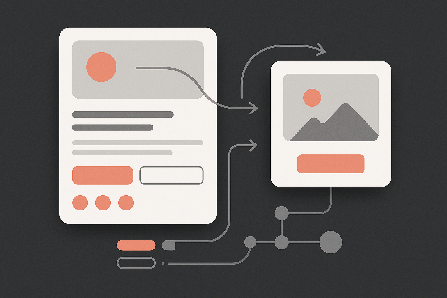
A landing page for paid acquisition should arrange elements in a straightforward sequence. The order below emphasises speed: satisfy recognition, then intention, then trust.
1. Instant recognition: ad creative carryover
Open with the ad’s headline and imagery so returning signals reinforce a correct click. Include the offer or benefit in the hero headline and subhead.
2. Immediate action: single, prominent CTA
Place one clear CTA above the fold that reflects the ad's intent. Avoid competing CTAs. If you genuinely need two actions (e.g., "Book demo" and "Download whitepaper"), use one primary and make the other visually secondary.
3. Quick proof: micro-evidence package
Just below the hero, present 2–3 pieces of bite-sized proof: a short testimonial, a logo strip or a metric ("95% renewal rate"). These are not substitutes for deeper proof; they lower initial scepticism.
4. Benefits and specifics: match audience expectations
Explain how the product helps with clear, benefit-led bullets or short paragraphs. Keep language simple and linked to the ad’s claim. Use screenshots or short explainer visuals to reduce imagination work.
5. Deeper proof and risk reversal
Bring in a concise case study, a customer quote with a name and role, and a clear guarantee (trial, refund). For higher-value offers, include pricing ranges to filter out mismatches.
6. Low-friction form and post-conversion experience
Keep forms minimal. For demos, ask only what you need to qualify leads. After conversion, provide a clear next step (email confirmation, immediate booking link). The follow-up experience must deliver on the page’s promise.
---
What good alignment looks like in practice
- Ad: "Book a 20-minute growth plan for ecommerce stores" → Landing hero: "20-minute growth plan for ecommerce stores"; CTA: "Reserve my slot"; proof: two case-study headlines with conversion lift figures.
- Ad: "Free audit: reduce churn by 15%" → Landing hero: "Free churn audit"; short form for email and site URL; proof: metric-driven testimonial and a 24-hour turnaround promise.
When these pieces line up, conversion rates climb because the user’s cognitive load is low: they recognise the message, understand the next step and see immediate reasons to trust you.
---
Types of proof that actually move paid traffic
Customer logos and short quotes Quantified outcomes (percent improvements, ROI numbers) Verified third-party badges or awards Screenshots that show the product doing the thing the ad promises Short video testimonials or concise case-study pull-quotes
Use the smallest credible unit of proof you have. A single short quote with a measurable result often outperforms a long case study because it’s scannable on arrival.
---
Common alignment mistakes and how to fix them
Mistake: ad promises a discount, page shows features
Fix: lead with the price/discount in the hero, then explain how the product delivers value. Make sure the CTA references the offer ("Claim 20% off").
Mistake: CTA asks for a long form after a low-commitment ad
Fix: switch to a micro-conversion and follow up with a qualifying email sequence. Or use progressive profiling where you ask for minimal data first.
Mistake: proof that doesn’t match the audience
Fix: swap generic logos for proof from the same vertical or company size. Users trust examples that resemble them.
Mistake: slow-loading hero images and heavy scripts
Fix: optimise for speed. Paid traffic is impatient: reduce page weight, lazy-load secondary assets and prioritise the hero content.
---
Measurement and experimentation
Measure the right things. For paid campaigns, focus on:
Post-click conversion rate (primary metric) Cost per lead and cost per qualified lead Time on page and scroll depth for long forms or content-rich pages Bounce rate segmented by ad creative and keyword
Test iteratively. Start with headline and CTA wording, then move to proof placement and form length. Use A/B tests that isolate single variables and run until you reach statistically meaningful sample sizes.
For higher-ticket offers, test variations of risk-reversal (trial, guarantee) as these often produce the largest lifts.
---
Governance: a practical process for teams
Set a simple handover between paid media and conversion owners: each new campaign must ship a landing page brief that includes the primary claim, target audience, funnel intent and available proof. Treat the brief as mandatory; it prevents common disconnects where creatives and landing pages diverge.
Add a 30-minute pre-launch checklist meeting where media, design and analytics agree on the hero headline, primary CTA and the minimum proof assets required for launch.
---
Final note and a practical offer
Paid acquisition is predictable when you remove surprise from the landing experience. Align the ad’s message, the user’s intent and the proof you present in the first 5–10 seconds after click. That alignment lowers friction, increases trust and reduces wasted spend.
If you want to move from ad clicks to a reliable lead generation engine, speak with Dool — we build landing experiences and connected lead systems that match ad intent and prove value quickly.